Interface Content
I work on applications and websites where guiding the user and ensuring a seamless experience is key.
In these projects, I collaborated closely with UX/UI Designers, User Researchers, Engineers, and Product Managers to deliver clear, user-centered content.
Much of my work is protected by NDA, but feel free to get in touch to learn more about my experience across different business areas.
You can also explore my work in Information Architecture and Copywriting.
TRAVEL & TOURISM
Sign-up
Challenge
TAP, Portugal’s flag carrier, needed a sign-up and booking form that worked for a diverse user base — spanning different ages and levels of digital literacy. The challenge was to request all necessary information while keeping the experience simple and trustworthy.
Approach
We structured the form by grouping information into clear sections and adding short explanations for each part. These descriptions explained why the data was requested and how it would be used, reducing friction and uncertainty.
Outcome
This approach not only increased user trust but also improved data accuracy by encouraging users to share the correct information from the start.

MOBILITY
Onboarding
Challenge
Via Verde, Portugal’s leading mobility services provider, needed an onboarding experience that introduced users to its wide range of services — from highway tolls to parking, fuel, and drive-through — while keeping the process simple and engaging.
Approach
We designed a 4-screen onboarding flow that highlighted the app’s key benefits and showcased additional services to users who only knew the basic toll feature. Users could move forward, go back for more detail, or skip steps altogether. The flow also asked for contact and notification permissions, with clear explanations of why the information was needed.
Outcome
The onboarding experience increased awareness of Via Verde’s broader service ecosystem, building user trust while encouraging engagement beyond the basic toll service.

TRAVEL & TOURISM
Purchase flow
Challenge
TAP, Portugal’s flag carrier, needed to optimize its flight search and purchase flow for a diverse user base with different levels of digital literacy. The challenge was to make the experience efficient, clear, and enjoyable while supporting business goals.
Approach
We simplified the flight search process to require the fewest possible steps. To reduce friction, we removed unnecessary text, used a conversational tone, and introduced icons within the UI. These adjustments made the flow more fluid, user-friendly, and engaging.
Outcome
The streamlined purchase flow improved usability, increased clarity, and helped users complete bookings more confidently and efficiently.

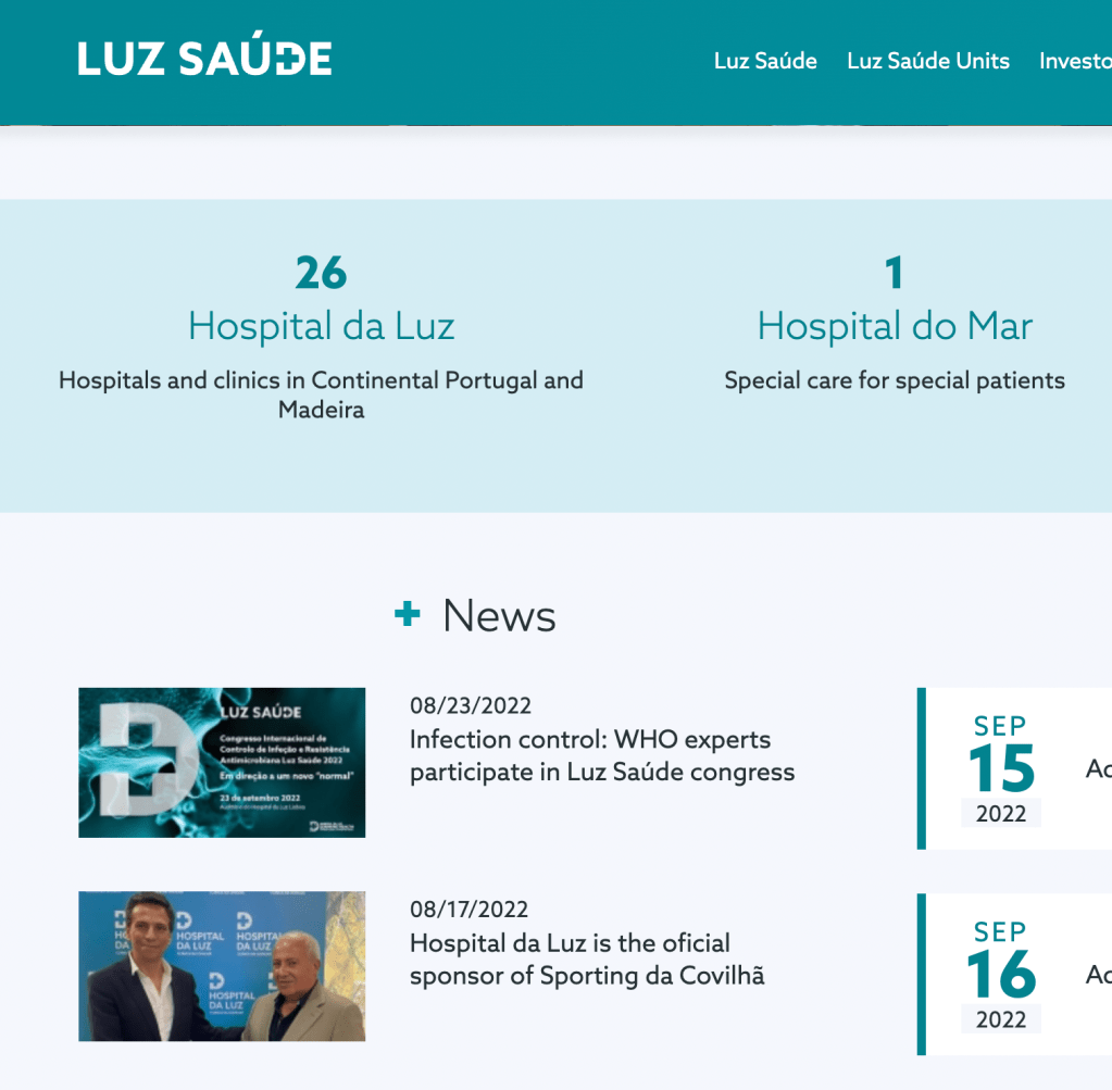
HEALTH
CMS microcopy
Challenge
Luz Saúde, one of Portugal’s largest private healthcare groups, needed a CMS capable of managing content for 29 websites. The platform (DNN) could technically support this, but its complex UI made it difficult for non-specialist users such as doctors, nurses, and marketers.
Approach
We redesigned the CMS experience through microcopy: redefining labels, buttons, and messages to simplify navigation and make the interface intuitive for professionals with little to no prior CMS experience. To further support adoption, we created a user manual tailored to each type of user.
Outcome
The new microcopy and supporting documentation made content management more fluid and accessible, empowering healthcare professionals to confidently manage digital content across multiple websites.
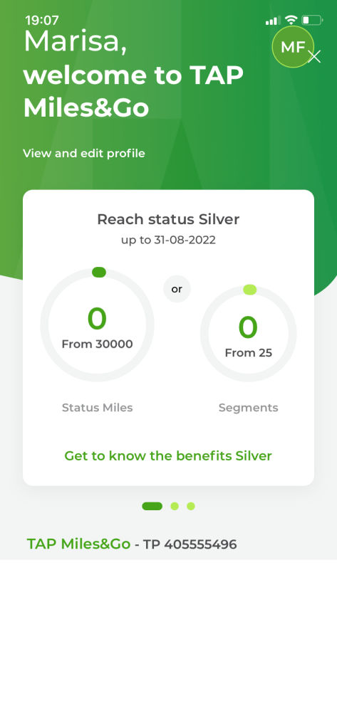
TRAVEL & TOURISM
Loyalty
Challenge
TAP’s loyalty program has multiple tiers and can feel complex, especially for newcomers unfamiliar with its advantages. The challenge was to design a dashboard that made essential information easy to access while also communicating the value of the program.
Approach
We highlighted key data such as miles and segments so users could quickly check their status while booking flights. To motivate users, instead of showing “0 miles,” the dashboard displayed the maximum required value, making goals clearer. For newcomers, we added contextual copy to introduce the benefits of their current tier.
Outcome
The redesigned dashboard improved clarity and usability, helping seasoned travelers track progress at a glance while guiding new members to better understand — and engage with — the loyalty program.
See my work in information architecture and copywriting.
